Hello World
Creates a radio control by manipulation of the DroidScript's list control.
A radio control allows the user to select only one item in a list. For selecting multiple items in a list, use checkbox.
Example - Basic
cfg.Light
cfg.MUI
function OnStart()
{
color = MUI.colors.teal
app.InitializeUIKit(color.teal)
lay = MUI.CreateLayout("Linear", "FillXY,VCenter")
var list = "Apple, Mango, Banana"
rad = MUI.CreateRadio(list)
lay.AddChild(rad)
app.AddLayout(lay)
}
cfg.MUI
function OnStart()
{
color = MUI.colors.teal
app.InitializeUIKit(color.teal)
lay = MUI.CreateLayout("Linear", "FillXY,VCenter")
var list = "Apple, Mango, Banana"
rad = MUI.CreateRadio(list)
lay.AddChild(rad)
app.AddLayout(lay)
}
Example - With callback
cfg.Light
cfg.MUI
function OnStart()
{
color = MUI.colors.teal
app.InitializeUIKit(color.teal)
lay = MUI.CreateLayout("Linear", "FillXY,VCenter")
var list = "Apple, Mango, Banana"
rad = MUI.CreateRadio(list)
rad.SetOnTouch(OnTouch)
lay.AddChild(rad)
app.AddLayout(lay)
}
function OnTouch(name, index)
{
app.ShowPopup(name+" : "+index)
}
Methods
The following methods are available on the Radio object:
Focus()
GetAbsHeight() → Number: integer
GetAbsWidth() → Number: integer
GetItemByIndex(
index )
→ Object
GetLength() → Number: integer
GetParent() → app object
GetTextSize(
mode )
→ Number
GetType() → String: “List”
Gone()
Hide()
IsEnabled() → Boolean
IsVisible() → Boolean
RemoveItem(
title )
SetEllipsize(
mode )
SetEnabled(
enable )
SetFontFile(
file )
SetTextColor1(
clr )
SetTextColor2(
clr )
Show()
Boolean
app object
Number
String
unknown
Number: factor
Number: fraction (0..1)
Number: integer
Number: milliseconds
Number: 0..0.99 or 1..256
String:
hexadecimal:“#rrggbb” , “#aarrggbb”
colourName:“red” , “green” , ...
hexadecimal:
colourName:
String: comma “,” separated
String: path to file ( “/absolute/...” or “relative/...” )
String: comma “,” separated: “strings”
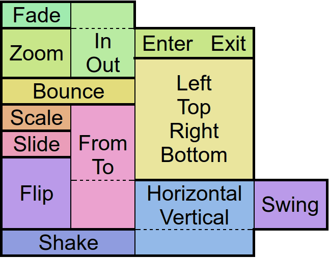
String: “NewsPaper” or “Jelly” or “Flash” or “RubberBand” or “Swing” or “TaDa” or “Bounce” or “Fall” or “FallRotate” or “
 ”
”
”String: “px”
String: “screen” , “px”
String: “left-right” or “right-left” or “top-bottom” or “bottom-top” or “bl-tr” or “br-tl” or “tl-br” or “tr-bl”
String: “repeat”
String: “Add” or “Multiply” or “clear” or “darken” or “lighten” or “overlay” or “screen” or “xor” or “src_in” or “src_out” or “src_atop” or “src_over” or “dst_in” or “dst_out” or “dst_atop” or “dst_over”
String: “start” or “middle” or “end”
String: “px” or “sp” or “dip” or “mm” or “pt”
String: “px” or “sp” or “dip” or “dp” or “mm” or “pt”
String: “Show” or “Hide” or “Gone”
String: “Linear.None” or “Quadratic.In/Out” or “Cubic.In/Out” or “Quartic.In/Out” or “Quintic.In/Out” or “Sinusoidal.In/Out” or “Exponential.In/Out” or “Circular.In/Out” or “Elastic.In/Out” or “Back.In/Out” or “Bounce.In/Out”
List: boolean,char,byte,short,int,long,float,double,String,CharSequence,...
function(
type
)
function(
src
)
function()
rd.Animate
Animates the control.
There are
“in” -Animations which are used to show objects from hidden state
“out” -animations which are used to hide objects in visible state and
“static” -animations which keep the visible state.
Animates the control.
There are
rd.CheckItemByIndex
Checks a corresponding item
Checks a corresponding item
rd.ClearFocus
Removes the focus of the control so that the user no longer has immediate access to it.
Removes the focus of the control so that the user no longer has immediate access to it.
rd.Focus
Set the focus to the control so that the user can interact with it immediately.
Set the focus to the control so that the user can interact with it immediately.
rd.GetAbsHeight
Get the absolute height of the control in pixels.
Get the absolute height of the control in pixels.
rd.GetAbsWidth
Get the absolute width of the control in pixels.
Get the absolute width of the control in pixels.
rd.GetCheckItem
Gets the checked item in the list
Gets the checked item in the list
rd.GetHeight
Get the height of the control as screen height relative float or in pixels with the px option.
Get the height of the control as screen height relative float or in pixels with the px option.
rd.GetItem
Get item
Get item
rd.GetItemByIndex
Get item by index
Get item by index
rd.GetLeft
Get the distance from the control to the left parent border as width relative float or in pixels with the px option.
Get the distance from the control to the left parent border as width relative float or in pixels with the px option.
rd.GetLength
Get length
Get length
rd.GetList
Get list
Get list
rd.GetParent
Returns the parent control object where the object was added to - commonly a layout.
Returns the parent control object where the object was added to - commonly a layout.
rd.GetPosition
Returns data about the position and size of the control.
If the screen option is given the position on the screen will be returned. Otherwise relative to the parent control.
The px options turns the relative values into pixels.
Returns data about the position and size of the control.
If the screen option is given the position on the screen will be returned. Otherwise relative to the parent control.
The px options turns the relative values into pixels.
rd.GetTextSize
Returns the current size of the contained text. If the px option is given the size will be retured in pixels.
Returns the current size of the contained text. If the px option is given the size will be retured in pixels.
rd.GetTop
Get the distance from the control to the upper parent border as height relative float or in pixels with the px option.
Get the distance from the control to the upper parent border as height relative float or in pixels with the px option.
rd.GetType
Get type
Get type
rd.GetVisibility
Returns the current visibility state of the control. The Values are:
Show: visible
Hide: invisible but still consuming space
Gone: invisible and not consuming space
Returns the current visibility state of the control. The Values are:
Show: visible
Hide: invisible but still consuming space
Gone: invisible and not consuming space
rd.GetWidth
Get the width of the control as screen width relative float or in pixels with the px option.
Get the width of the control as screen width relative float or in pixels with the px option.
rd.Gone
Hides the control without consuming any more layout space as if it were never there.
Hides the control without consuming any more layout space as if it were never there.
rd.Hide
Hide the control but keep the layout space free.
Hide the control but keep the layout space free.
rd.InsertItem
Insert item
Insert item
rd.IsEnabled
Returns whether the control is currently useable by the user.
Returns whether the control is currently useable by the user.
rd.IsOverlap
Returns whether the control overlaps with another by a given distance.
Returns whether the control overlaps with another by a given distance.
rd.IsVisible
Returns whether the control is currently visible to the user, ignoring overlaying controls.
Returns whether the control is currently visible to the user, ignoring overlaying controls.
rd.Method
Allows access to other functions defined on the object in Java via reflection.
Allows access to other functions defined on the object in Java via reflection.
Note: This function is a premium feature. Please consider subscribing to Premium to use this feature and support DroidScript in its further development.
rd.RemoveAll
Remove all
Remove all
rd.RemoveItem
Remove item
Remove item
rd.RemoveItemByIndex
Remove item by index
Remove item by index
rd.ScrollToItem
Scroll to item
Scroll to item
rd.ScrollToItemByIndex
Scroll to item by index
Scroll to item by index
rd.SelectItem
Select item
Select item
rd.SelectItemByIndex
Select item by index
Select item by index
rd.SetBackAlpha
Set the transparency of the background by an alpha value between 0 (no transparency) and 0.99 (full transparent) or 1 (no transparency) and 256 (full transparent)
Set the transparency of the background by an alpha value between 0 (no transparency) and 0.99 (full transparent) or 1 (no transparency) and 256 (full transparent)
rd.SetBackColor
Changes the background color of the control.
Changes the background color of the control.
rd.SetBackGradient
Define the background color of the control with a gradient. The default gradient direction is from top to bottom, but you can change it from left to right and the reversed versions of course.
Define the background color of the control with a gradient. The default gradient direction is from top to bottom, but you can change it from left to right and the reversed versions of course.
rd.SetBackGradientRadial
Define a radial color gradient for the background of control.
Define a radial color gradient for the background of control.
rd.SetBackground
Changes the background to an image which can be repeated using the repeat option.
An image which is often used with that option is '/res/drawable/pattern_carbon' - try it out!
Changes the background to an image which can be repeated using the repeat option.
An image which is often used with that option is '/res/drawable/pattern_carbon' - try it out!
rd.SetColorFilter
Adjust the visual color effect with a color and a given BlendMode. More information about BlendMode can be found in the Android Developer page.
Adjust the visual color effect with a color and a given BlendMode. More information about BlendMode can be found in the Android Developer page.
rd.SetColumnWidths
Set column widths
Set column widths
rd.SetDivider
Set divider
Set divider
rd.SetEllipsize
Will cause the inner text to be broken with ... at the start or the end if it cannot fit in the control.
Will cause the inner text to be broken with ... at the start or the end if it cannot fit in the control.
rd.SetEllipsize1
Set ellipsize1
Set ellipsize1
rd.SetEllipsize2
Set ellipsize2
Set ellipsize2
rd.SetEnabled
En/Disable the control physically and visually so that the user can/can not access the control. Events like OnTouch will still be fired.
En/Disable the control physically and visually so that the user can/can not access the control. Events like OnTouch will still be fired.
rd.SetFontFile
Change the font style by defining a font file.
Change the font style by defining a font file.
rd.SetHiTextColor1
Set hi text color1
Set hi text color1
rd.SetHiTextColor2
Set hi text color2
Set hi text color2
rd.SetList
Set list
Set list
rd.SetMargins
Define a distance to other controls on each side of the control.
Define a distance to other controls on each side of the control.
rd.SetOnLongTouch
Define a callback function which is called when the object has been long pressed.
Define a callback function which is called when the object has been long pressed.
rd.SetOnSelect
Calls a function when the user selects an item in the list
Calls a function when the user selects an item in the list
rd.SetOnTouch
Define a callback function that is called when the user touches the control.
Define a callback function that is called when the user touches the control.
rd.SetPosition
Defines the position and size for the control if the parent is an absolute layout.
Defines the position and size for the control if the parent is an absolute layout.
rd.SetScale
Scales the control along with its contents by the factors passed to the function.
Scales the control along with its contents by the factors passed to the function.
rd.SetSize
Change the size of the control in either screen relative values or in pixels if the px option was given.
Change the size of the control in either screen relative values or in pixels if the px option was given.
rd.SetTextColor
Change the text color of the contained text.
Change the text color of the contained text.
rd.SetTextColor1
Set text color1
Set text color1
rd.SetTextColor2
Set text color2
Set text color2
rd.SetTextMargins
Set text margins
Set text margins
rd.SetTextShadow
Define a shadow displayed around the control.
The sun is always shining so there has to be one. Always.
Define a shadow displayed around the control.
The sun is always shining so there has to be one. Always.
rd.SetTextShadow1
Set text shadow1
Set text shadow1
rd.SetTextShadow2
Set text shadow2
Set text shadow2
rd.SetTextSize
Change the size of the contained text.
Change the size of the contained text.
rd.SetTextSize1
Set text size1
Set text size1
rd.SetTextSize2
Set text size2
Set text size2
rd.SetVisibility
Change the visibility of the control to one of the available modes:
Show: visible
Hide: invisible but still consuming space
Gone: invisible and not consuming space
Change the visibility of the control to one of the available modes:
Show: visible
Hide: invisible but still consuming space
Gone: invisible and not consuming space
rd.Show
Set the visibility of the control to“Show” .
Set the visibility of the control to
rd.Tween
Performs an animation on the control.
The target object is for the position, size and rotation that the control has at the end of the animation.
The type specifies the behavior and the speed of the animation. Separated by a dot, you must also specify whether you want to apply this behavior to the beginning (In), end (Out), or to both (InOut) times of the animation.
With the amount of repeats you can control how many times you want to play the animation.
If you have jojo activated, the animation will alternate between forward and backward playback, so that if the repetition value is odd, the control will be at the start position again at the end of the animation.
Finally the callback function will be called after the animation has finished. Well, it's about time!