Hello World
Creates a paragraph text.
Example - Paragraph-Sample
cfg.Light
cfg.MUI
function OnStart()
{
color = MUI.colors.teal
app.InitializeUIKit(color.teal, "Light")
lay = MUI.CreateLayout("Linear", "VCenter,FillXY")
var text = "Lorem ipsum dolor sit amet, consectetur adipiscing elit. Nulla venenatis nunc nec orci finibus blandit. Nam nec consectetur odio. Sed a erat ultrices lectus volutpat malesuada. Aliquam id dictum metus."
p1 = MUI.AddText(lay, text, 0.9, null, "Multiline,Paragraph,Light")
p2 = MUI.AddTextParagraph(lay, text, 0.9, null, "Multiline", null, "Light")
p3 = MUI.CreateTextParagraph(text, 0.9, null, "Multiline", null, "Light")
lay.AddChild(p3)
app.AddLayout(lay)
}
Methods
The following methods are available on the TextParagraph object:
data → Object
Focus()
GetAbsHeight() → Number: integer
GetAbsWidth() → Number: integer
GetHtml() → Object
GetLineCount() → Number: integer
GetLineStart(
line )
→ Number: integer
GetLineTop(
line )
→ Number
GetMaxLines() → Number: integer
GetParent() → app object
GetText() → String
GetTextSize(
mode )
→ Number
GetType() → String: “Text”
Gone()
Hide()
IsEnabled() → Boolean
IsVisible() → Boolean
SetEllipsize(
mode )
SetEnabled(
enable )
SetFontFile(
file )
Show()
Boolean
app object
Number
String
unknown
Number: factor
Number: fraction (0..1)
Number: integer
Number: milliseconds
Number: -180..180
Number: -100..100
Number: 0..100
Number: 0..0.99 or 1..256
String:
hexadecimal:“#rrggbb” , “#aarrggbb”
colourName:“red” , “green” , ...
hexadecimal:
colourName:
String: comma “,” separated
String: html code
String: path to file ( “/absolute/...” or “relative/...” )
String: “DS text options”
String: “Can be Thin” or “Light” or “Regular” or “Medium” or “Bold”
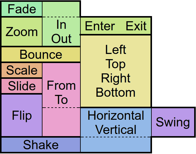
String: “NewsPaper” or “Jelly” or “Flash” or “RubberBand” or “Swing” or “TaDa” or “Bounce” or “Fall” or “FallRotate” or “
 ”
”
”String: “px”
String: “screen” , “px”
String: “left-right” or “right-left” or “top-bottom” or “bottom-top” or “bl-tr” or “br-tl” or “tl-br” or “tr-bl”
String: “repeat”
String: “Add” or “Multiply” or “clear” or “darken” or “lighten” or “overlay” or “screen” or “xor” or “src_in” or “src_out” or “src_atop” or “src_over” or “dst_in” or “dst_out” or “dst_atop” or “dst_over”
String: “start” or “middle” or “end”
String: “px” or “sp” or “dip” or “mm” or “pt”
String: “px” or “sp” or “dip” or “dp” or “mm” or “pt”
String: “Show” or “Hide” or “Gone”
String: “Linear.None” or “Quadratic.In/Out” or “Cubic.In/Out” or “Quartic.In/Out” or “Quintic.In/Out” or “Sinusoidal.In/Out” or “Exponential.In/Out” or “Circular.In/Out” or “Elastic.In/Out” or “Back.In/Out” or “Bounce.In/Out”
List: boolean,char,byte,short,int,long,float,double,String,CharSequence,...
function(
type
)
function(
src
)
function()
function(
event
)
function(
event
)
function(
event
)
txp.AdjustColor
Adjust the visual color effect of the control by setting the Hue (by angle in degrees in a color circle), the saturation, brightness and contrast of the control.
Adjust the visual color effect of the control by setting the Hue (by angle in degrees in a color circle), the saturation, brightness and contrast of the control.
txp.Animate
Animates the control.
There are
“in” -Animations which are used to show objects from hidden state
“out” -animations which are used to hide objects in visible state and
“static” -animations which keep the visible state.
Animates the control.
There are
txp.ClearFocus
Removes the focus of the control so that the user no longer has immediate access to it.
Removes the focus of the control so that the user no longer has immediate access to it.
data
txp.Focus
Set the focus to the control so that the user can interact with it immediately.
Set the focus to the control so that the user can interact with it immediately.
txp.GetAbsHeight
Get the absolute height of the control in pixels.
Get the absolute height of the control in pixels.
txp.GetAbsWidth
Get the absolute width of the control in pixels.
Get the absolute width of the control in pixels.
txp.GetHeight
Get the height of the control as screen height relative float or in pixels with the px option.
Get the height of the control as screen height relative float or in pixels with the px option.
txp.GetHtml
Get html
Get html
txp.GetLeft
Get the distance from the control to the left parent border as width relative float or in pixels with the px option.
Get the distance from the control to the left parent border as width relative float or in pixels with the px option.
txp.GetLineCount
Get line count
Get line count
txp.GetLineStart
Get line start
Get line start
txp.GetLineTop
Get line top
Get line top
txp.GetMaxLines
Get max lines
Get max lines
txp.GetParent
Returns the parent control object where the object was added to - commonly a layout.
Returns the parent control object where the object was added to - commonly a layout.
txp.GetPosition
Returns data about the position and size of the control.
If the screen option is given the position on the screen will be returned. Otherwise relative to the parent control.
The px options turns the relative values into pixels.
Returns data about the position and size of the control.
If the screen option is given the position on the screen will be returned. Otherwise relative to the parent control.
The px options turns the relative values into pixels.
txp.GetText
Returns the current displayed text of the control.
Returns the current displayed text of the control.
txp.GetTextSize
Returns the current size of the contained text. If the px option is given the size will be retured in pixels.
Returns the current size of the contained text. If the px option is given the size will be retured in pixels.
txp.GetTop
Get the distance from the control to the upper parent border as height relative float or in pixels with the px option.
Get the distance from the control to the upper parent border as height relative float or in pixels with the px option.
txp.GetType
Get type
Get type
txp.GetVisibility
Returns the current visibility state of the control. The Values are:
Show: visible
Hide: invisible but still consuming space
Gone: invisible and not consuming space
Returns the current visibility state of the control. The Values are:
Show: visible
Hide: invisible but still consuming space
Gone: invisible and not consuming space
txp.GetWidth
Get the width of the control as screen width relative float or in pixels with the px option.
Get the width of the control as screen width relative float or in pixels with the px option.
txp.Gone
Hides the control without consuming any more layout space as if it were never there.
Hides the control without consuming any more layout space as if it were never there.
txp.Hide
Hide the control but keep the layout space free.
Hide the control but keep the layout space free.
txp.IsEnabled
Returns whether the control is currently useable by the user.
Returns whether the control is currently useable by the user.
txp.IsOverlap
Returns whether the control overlaps with another by a given distance.
Returns whether the control overlaps with another by a given distance.
txp.IsVisible
Returns whether the control is currently visible to the user, ignoring overlaying controls.
Returns whether the control is currently visible to the user, ignoring overlaying controls.
txp.Log
Log
Log
txp.Method
Allows access to other functions defined on the object in Java via reflection.
Allows access to other functions defined on the object in Java via reflection.
Note: This function is a premium feature. Please consider subscribing to Premium to use this feature and support DroidScript in its further development.
txp.SetBackAlpha
Set the transparency of the background by an alpha value between 0 (no transparency) and 0.99 (full transparent) or 1 (no transparency) and 256 (full transparent)
Set the transparency of the background by an alpha value between 0 (no transparency) and 0.99 (full transparent) or 1 (no transparency) and 256 (full transparent)
txp.SetBackColor
Changes the background color of the control.
Changes the background color of the control.
txp.SetBackGradient
Define the background color of the control with a gradient. The default gradient direction is from top to bottom, but you can change it from left to right and the reversed versions of course.
Define the background color of the control with a gradient. The default gradient direction is from top to bottom, but you can change it from left to right and the reversed versions of course.
txp.SetBackGradientRadial
Define a radial color gradient for the background of control.
Define a radial color gradient for the background of control.
txp.SetBackground
Changes the background to an image which can be repeated using the repeat option.
An image which is often used with that option is '/res/drawable/pattern_carbon' - try it out!
Changes the background to an image which can be repeated using the repeat option.
An image which is often used with that option is '/res/drawable/pattern_carbon' - try it out!
txp.SetColorFilter
Adjust the visual color effect with a color and a given BlendMode. More information about BlendMode can be found in the Android Developer page.
Adjust the visual color effect with a color and a given BlendMode. More information about BlendMode can be found in the Android Developer page.
txp.SetEllipsize
Will cause the inner text to be broken with ... at the start or the end if it cannot fit in the control.
Will cause the inner text to be broken with ... at the start or the end if it cannot fit in the control.
txp.SetEnabled
En/Disable the control physically and visually so that the user can/can not access the control. Events like OnTouch will still be fired.
En/Disable the control physically and visually so that the user can/can not access the control. Events like OnTouch will still be fired.
txp.SetFontFile
Change the font style by defining a font file.
Change the font style by defining a font file.
txp.SetHtml
Change the current text of the control to html-formatted text.
Change the current text of the control to html-formatted text.
txp.SetLog
Set log
Set log
txp.SetMargins
Define a distance to other controls on each side of the control.
Define a distance to other controls on each side of the control.
txp.SetOnLongTouch
Define a callback function which is called when the object has been long pressed.
Define a callback function which is called when the object has been long pressed.
txp.SetOnTouch
Define a callback function that is called when the user touches the control.
Define a callback function that is called when the user touches the control.
txp.SetOnTouchDown
Define a callback function which is called when the user started toching the control.
Define a callback function which is called when the user started toching the control.
txp.SetOnTouchMove
Define a callback function which is called when the user drags his finger over the screen.
Define a callback function which is called when the user drags his finger over the screen.
txp.SetOnTouchUp
Define a callback function which is called when the users finger leaves the screen.
Define a callback function which is called when the users finger leaves the screen.
txp.SetPadding
Define distances that elements within the control are to maintain from the control borders.
Define distances that elements within the control are to maintain from the control borders.
txp.SetPosition
Defines the position and size for the control if the parent is an absolute layout.
Defines the position and size for the control if the parent is an absolute layout.
txp.SetScale
Scales the control along with its contents by the factors passed to the function.
Scales the control along with its contents by the factors passed to the function.
txp.SetSize
Change the size of the control in either screen relative values or in pixels if the px option was given.
Change the size of the control in either screen relative values or in pixels if the px option was given.
txp.SetText
Change the currently displayed text in the control.
Change the currently displayed text in the control.
txp.SetTextColor
Change the text color of the contained text.
Change the text color of the contained text.
txp.SetTextShadow
Define a shadow displayed around the control.
The sun is always shining so there has to be one. Always.
Define a shadow displayed around the control.
The sun is always shining so there has to be one. Always.
txp.SetTextSize
Change the size of the contained text.
Change the size of the contained text.
txp.SetTouchable
En/Disables touch events to be fired on the control. Other events like OnChange will still be fired.
En/Disables touch events to be fired on the control. Other events like OnChange will still be fired.
txp.SetVisibility
Change the visibility of the control to one of the available modes:
Show: visible
Hide: invisible but still consuming space
Gone: invisible and not consuming space
Change the visibility of the control to one of the available modes:
Show: visible
Hide: invisible but still consuming space
Gone: invisible and not consuming space
txp.Show
Set the visibility of the control to“Show” .
Set the visibility of the control to
txp.Tween
Performs an animation on the control.
The target object is for the position, size and rotation that the control has at the end of the animation.
The type specifies the behavior and the speed of the animation. Separated by a dot, you must also specify whether you want to apply this behavior to the beginning (In), end (Out), or to both (InOut) times of the animation.
With the amount of repeats you can control how many times you want to play the animation.
If you have jojo activated, the animation will alternate between forward and backward playback, so that if the repetition value is odd, the control will be at the start position again at the end of the animation.
Finally the callback function will be called after the animation has finished. Well, it's about time!