Hello World
Creates a radio button control.
A radio control allows the user to select only one item in a list. For selecting multiple items in a list, use checkbox.
Example - Basic
cfg.Light
cfg.MUI
function OnStart()
{
color = MUI.colors.teal
app.InitializeUIKit(color.teal)
lay = MUI.CreateLayout("Linear", "FillXY,VCenter")
var list = "Apps, Games, Movies, Books"
rad = MUI.CreateRadioButtons(list)
lay.AddChild(rad)
app.AddLayout(lay)
}
cfg.MUI
function OnStart()
{
color = MUI.colors.teal
app.InitializeUIKit(color.teal)
lay = MUI.CreateLayout("Linear", "FillXY,VCenter")
var list = "Apps, Games, Movies, Books"
rad = MUI.CreateRadioButtons(list)
lay.AddChild(rad)
app.AddLayout(lay)
}
Example - With callback
cfg.Light
cfg.MUI
function OnStart()
{
color = MUI.colors.teal
app.InitializeUIKit(color.teal)
lay = MUI.CreateLayout("Linear", "FillXY,VCenter")
var list = "Apps, Games, Movies, Books"
rad = MUI.CreateRadioButtons(list, 1, null, "Vertical")
rad.SetOnTouch(OnTouch)
lay.AddChild(rad)
app.AddLayout(lay)
}
function OnTouch(name, index)
{
app.ShowPopup(name+" : "+index)
}
Methods
The following methods are available on the RadioButtons object:
Focus()
GetAbsHeight() → Number: integer
GetAbsWidth() → Number: integer
GetList() → List: Array of titles
GetParent() → app object
GetType() → String: “Radio”
Gone()
Hide()
IsEnabled() → Boolean
IsVisible() → Boolean
SetEnabled(
enable )
Show()
Toggle()
Boolean
app object
Number
Number: factor
Number: fraction (0..1)
Number: integer
Number: milliseconds
String:
hexadecimal:“#rrggbb” , “#aarrggbb”
colourName:“red” , “green” , ...
hexadecimal:
colourName:
String: “Vertical” or “Horizontal”
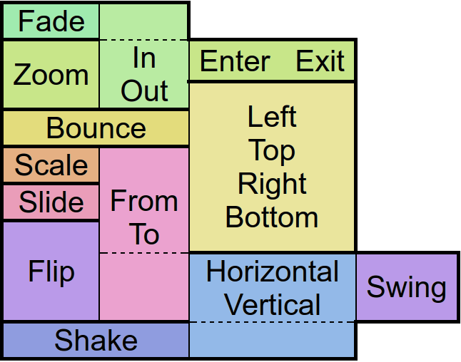
String: “NewsPaper” or “Jelly” or “Flash” or “RubberBand” or “Swing” or “TaDa” or “Bounce” or “Fall” or “FallRotate” or “
 ”
”
”String: “px”
String: “screen” , “px”
String: “px” or “sp” or “dip” or “mm” or “pt”
String: “px” or “sp” or “dip” or “dp” or “mm” or “pt”
String: “Show” or “Hide” or “Gone”
String: “Linear.None” or “Quadratic.In/Out” or “Cubic.In/Out” or “Quartic.In/Out” or “Quintic.In/Out” or “Sinusoidal.In/Out” or “Exponential.In/Out” or “Circular.In/Out” or “Elastic.In/Out” or “Back.In/Out” or “Bounce.In/Out”
List: A comma separated strings
function(
type
)
function(
src
)
function()
rdb.Animate
Animates the control.
There are
“in” -Animations which are used to show objects from hidden state
“out” -animations which are used to hide objects in visible state and
“static” -animations which keep the visible state.
Animates the control.
There are
rdb.CheckItemByIndex
Checks a corresponding item
Checks a corresponding item
rdb.ClearFocus
Removes the focus of the control so that the user no longer has immediate access to it.
Removes the focus of the control so that the user no longer has immediate access to it.
rdb.Focus
Set the focus to the control so that the user can interact with it immediately.
Set the focus to the control so that the user can interact with it immediately.
rdb.GetAbsHeight
Get the absolute height of the control in pixels.
Get the absolute height of the control in pixels.
rdb.GetAbsWidth
Get the absolute width of the control in pixels.
Get the absolute width of the control in pixels.
rdb.GetCheckItem
Gets the checked item in the list
Gets the checked item in the list
rdb.GetHeight
Get the height of the control as screen height relative float or in pixels with the px option.
Get the height of the control as screen height relative float or in pixels with the px option.
rdb.GetItem
Returns the corresponding item
Returns the corresponding item
rdb.GetLeft
Get the distance from the control to the left parent border as width relative float or in pixels with the px option.
Get the distance from the control to the left parent border as width relative float or in pixels with the px option.
rdb.GetList
Gets the list
Gets the list
rdb.GetParent
Returns the parent control object where the object was added to - commonly a layout.
Returns the parent control object where the object was added to - commonly a layout.
rdb.GetPosition
Returns data about the position and size of the control.
If the screen option is given the position on the screen will be returned. Otherwise relative to the parent control.
The px options turns the relative values into pixels.
Returns data about the position and size of the control.
If the screen option is given the position on the screen will be returned. Otherwise relative to the parent control.
The px options turns the relative values into pixels.
rdb.GetTop
Get the distance from the control to the upper parent border as height relative float or in pixels with the px option.
Get the distance from the control to the upper parent border as height relative float or in pixels with the px option.
rdb.GetType
Get type
Get type
rdb.GetVisibility
Returns the current visibility state of the control. The Values are:
Show: visible
Hide: invisible but still consuming space
Gone: invisible and not consuming space
Returns the current visibility state of the control. The Values are:
Show: visible
Hide: invisible but still consuming space
Gone: invisible and not consuming space
rdb.GetWidth
Get the width of the control as screen width relative float or in pixels with the px option.
Get the width of the control as screen width relative float or in pixels with the px option.
rdb.Gone
Hides the control without consuming any more layout space as if it were never there.
Hides the control without consuming any more layout space as if it were never there.
rdb.Hide
Hide the control but keep the layout space free.
Hide the control but keep the layout space free.
rdb.IsEnabled
Returns whether the control is currently useable by the user.
Returns whether the control is currently useable by the user.
rdb.IsOverlap
Returns whether the control overlaps with another by a given distance.
Returns whether the control overlaps with another by a given distance.
rdb.IsVisible
Returns whether the control is currently visible to the user, ignoring overlaying controls.
Returns whether the control is currently visible to the user, ignoring overlaying controls.
rdb.SetEnabled
En/Disable the control physically and visually so that the user can/can not access the control. Events like OnTouch will still be fired.
En/Disable the control physically and visually so that the user can/can not access the control. Events like OnTouch will still be fired.
rdb.SetMargins
Define a distance to other controls on each side of the control.
Define a distance to other controls on each side of the control.
rdb.SetOnLongTouch
Define a callback function which is called when the object has been long pressed.
Define a callback function which is called when the object has been long pressed.
rdb.SetOnSelect
Calls a function when the user selects an item in the list
Calls a function when the user selects an item in the list
rdb.SetPosition
Defines the position and size for the control if the parent is an absolute layout.
Defines the position and size for the control if the parent is an absolute layout.
rdb.SetScale
Scales the control along with its contents by the factors passed to the function.
Scales the control along with its contents by the factors passed to the function.
rdb.SetSize
Change the size of the control in either screen relative values or in pixels if the px option was given.
Change the size of the control in either screen relative values or in pixels if the px option was given.
rdb.SetVisibility
Change the visibility of the control to one of the available modes:
Show: visible
Hide: invisible but still consuming space
Gone: invisible and not consuming space
Change the visibility of the control to one of the available modes:
Show: visible
Hide: invisible but still consuming space
Gone: invisible and not consuming space
rdb.Show
Set the visibility of the control to“Show” .
Set the visibility of the control to
rdb.Toggle
Show or Hide the list
Show or Hide the list
rdb.Tween
Performs an animation on the control.
The target object is for the position, size and rotation that the control has at the end of the animation.
The type specifies the behavior and the speed of the animation. Separated by a dot, you must also specify whether you want to apply this behavior to the beginning (In), end (Out), or to both (InOut) times of the animation.
With the amount of repeats you can control how many times you want to play the animation.
If you have jojo activated, the animation will alternate between forward and backward playback, so that if the repetition value is odd, the control will be at the start position again at the end of the animation.
Finally the callback function will be called after the animation has finished. Well, it's about time!